
Appearance
Product Detail (Create and Edit)
Create:
/_Admin/commerce/product-management/create?SiteId=...&typeId={typeId or blank}
Edit:/_Admin/commerce/product-management/edit?SiteId=...&id={productId}
Full-screen form after creating a product on the list or clicking Edit; top to bottom: Basic information, custom fields (if any), variant options and variants (when variants not hidden); digital products also require digital product delivery per variant table. Save returns to product management list.
Relationship with list
| Page | Doc |
|---|---|
| List, filters, duplicate, batch delete | Product management (list) |
| This form | This page |
How to Enter
| Method | Route |
|---|---|
| Create | List Create product → choose "Blank product" or a product type (for digital, choose type with digital product checked) → product-management/create?typeId=... |
| Edit | List row edit → product-management/edit?id=... |
Breadcrumb usually: Product Management -> Edit product (create title may differ per UI).
Bottom fixed Cancel / Save / Save and return (KBottomBar), similar to content entry edit.
Basic Information
First white card (BasicInfo). Multilingual sites have Multilingual switch top-right; fields below can be maintained per default and each language.
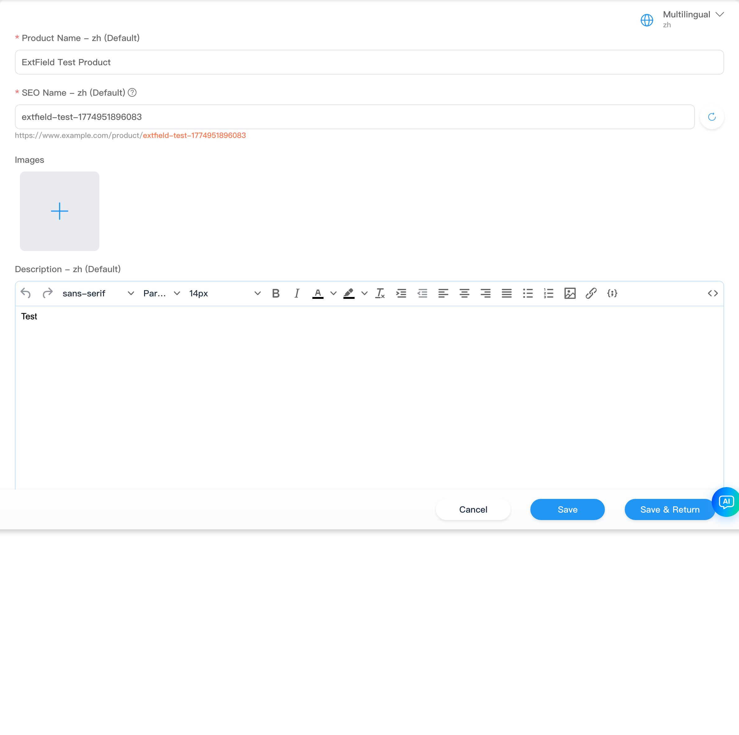
| Field | Description |
|---|---|
Product name (title) | Required; storefront display title. Multilingual: default title plus each language in customData.title |
SEO name (seoName) | Required; friendly URL. Cannot contain []\{}#%^*+=_|~<>.?!'"/:;,()$&@ or whitespace; unique site-wide. Input can generate suggestion from title (SeoName component, path=product) |
Images (images / featuredImage) | From media library; set featured image (featuredImage). Gallery and featured metadata in imageMetas |
Description (description) | Rich text (KEditor); multilingual same as title |
Categories (categories) | Tags for selected categories; green + opens picker linking product categories. Manual categories: delete on tag |
Tags (tags) | Enter new or select existing product tags |
Active (active) | Toggle: sellable on storefront |
Field display names configurable in product types / settings product custom fields (system fields like Title, SeoName, etc.).
Attributes (optional)
When settings has not enabled "Hide attributes", basic info card bottom adds Attributes: key-value list (KeyValueEditor) for product-level attributes; no forced 1:1 with variant dimensions below; fill as needed.
Custom Fields
Product custom fields (non-system) from settings rendered by CustomData, between basic info and variant sections; types include text, select, image, etc., with dynamic options on product types. Hidden when no custom fields.
How Variant Options Affect Variants
When settings has not enabled "Hide variants", lower section has variant options (OptionGroupEditor) and variant table (VariantEditor). Together they define storefront SKUs.
Key points (consistent with product-variant.ts):
| Action | Effect on variants |
|---|---|
| Add option group | Click + for empty group; need option name (e.g. Size) and at least one value before variant rows expand on that dimension |
| Add value to existing group | System duplicates new rows for variants not yet containing that value (no duplicate combos); existing combos unchanged |
| Rename group / value | Syncs name / value in all variant selectedOptions |
| Delete a value | If other variants still have other values on that dimension, deletes rows using that value; if only one value on dimension, removes dimension from rows |
| Delete entire group | Removes dimension from all variants and cleans related rows |
| Add variant (button) | With option groups defined, manually create SKU row; dialog picks value per dimension (no duplicate combo) |
Each variant is one separately priced, stocked, activatable SKU; selectedOptions is { name, value }[], e.g. Color: Red + Size: M. Storefront add-to-cart matches variant by selected combo.
Variant Options
OptionGroupEditor: one card per option group, collapsible edit.

| UI | Description |
|---|---|
| Group title | Click card to edit: Option name (e.g. Color, Size) |
| Type | Text or Color; color type uses color picker for values |
| Option values | Enter one by one; Enter or Tab to add. Display mode can show small image per value (variantOptions.items[].image) |
| Multilingual | When enabled, card Language icon edits translations for group and values |
| Done | End group edit; Delete icon removes entire group (triggers variant logic above) |
| Bottom + | Add new option group |
Option definitions write to product variantOptions (type, multilingual, per-item metadata) and link to Options column in variant table.
Variant List
Below variant options is variant table; when at least one option group exists and first variant has selectedOptions, Add variant appears above table (UI copy for manual SKU creation).

| Column / Action | Description |
|---|---|
| Image | Variant featured image; replaceable. If settings has meta template for Images, image metadata editable |
| Options | Current row selectedOptions display (e.g. Red / M) |
| Price | SKU price (currency symbol from settings) |
| Stock | newInventory: value written on save (with originalInventory; per API) |
| Sales | Read-only stats |
| Digital product | Digital products (isDigital) only; button opens delivery config; see digital products |
| Active | Whether SKU is sellable |
| Edit | Opens edit variant dialog |
| Delete | Available when more than one variant row |
Digital product delivery
If settings enables Digital product delivery required and product is digital, each variant must have at least one digital delivery item before Save.
Digital Products
When product is from product type with Digital product checked, or isDigital is true after save, variant table shows Digital product column (physical products omit it). Each variant SKU configures what buyers receive after payment; different variants can have different files, links, or text.
Open Configuration
In variant table Digital product column:
| State | Action |
|---|---|
| Not yet added | Upload file button (cloud upload icon) opens config dialog |
| One or more added | Digital button (count) opens same dialog |
Dialog title: Digital product.

Three Ways to Add Delivery Items
Click Add (dropdown arrow on primary button) top-left; choose type; can add multiple per variant delivery package.
| Method / menu item | Use | Configuration |
|---|---|---|
| File | Downloadable attachment (PDF, ZIP, installer, etc.) | Select local file uploads immediately; list Type is "File", Details shows file size. Stored in site digital product storage, linked to variant variantId |
| Link | External resource (cloud drive, video page, third-party download) | Sub-dialog: Name (buyer-visible title) and Link (URL, multiline). Details shows link text (truncated if long) |
| Text | No file needed: license key, serial, instructions, account/password, etc. | Sub-dialog: Name and Text (multiline). Shown to buyer or used in email templates after order |
All three types appear in dialog table after save:
| Column | Description |
|---|---|
| Name | Delivery item display name |
| Type | File / Link / Text (tag) |
| Details | File size; link and text show value summary |
| Row Delete | Remove item; File type on saved product may also delete remote uploaded file |
Same variant can mix types (e.g. PDF file + activation text + backup link).
Auto Delivery
Toolbar right Auto delivery checked by default. When checked, system can auto-send delivery to buyer per commerce rules when order conditions met; unchecked requires manual or other flow. Triggers and email templates: shipping and site commerce settings.
Close dialog when done; repeat for each variant row (multi-variant digital products each have own digitalItems).
Relationship with Save and Storefront
- On save, if Digital product delivery required enabled, empty
digitalItemson any variant shows Digital content cannot be empty and blocks submit. - Type download count / day limits defined on product type; complements "what to deliver" in this dialog.
- Storefront add-to-cart, checkout, and
k.commerceread variant-leveldigitalItems; development: k.commerce.
Edit Variant Dialog
Click row Edit to open edit variant dialog.
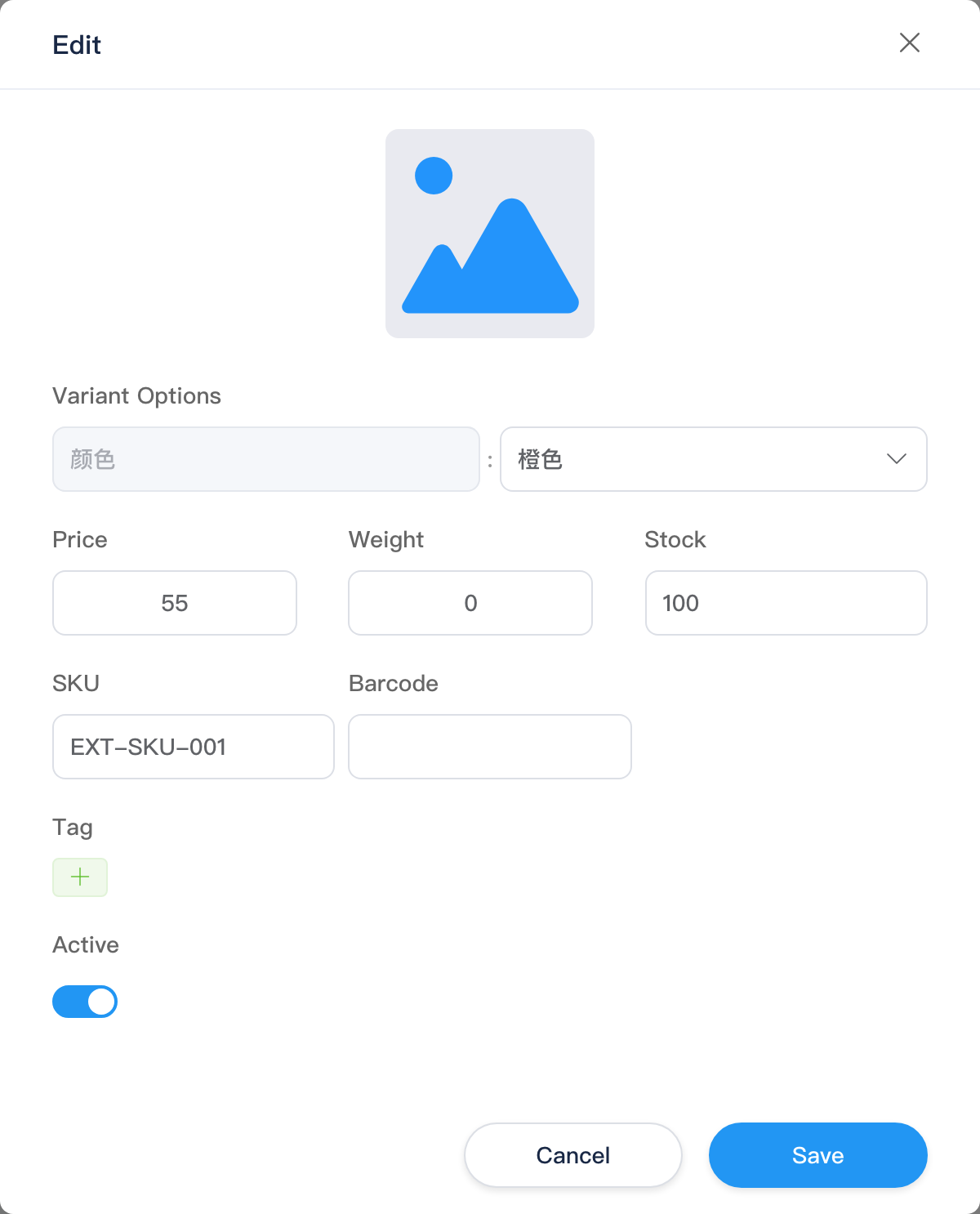
| Item | Description |
|---|---|
| Variant image | Large image area; can default to product featured image |
| Variant options | One row per dimension: Name (read-only) + Value (dropdown from existing values on that dimension across product variants) |
| Price / Weight / Stock | Number inputs |
| SKU / Barcode | Text |
| Tags | Variant-level tags (independent from product tags) |
| Active | SKU toggle |
Confirm writes back to table row; changing dimension value syncs name in variantOptions.
Add Variant Dialog
Click Add variant opens dialog (title often Create); same structure as edit, but dimension values must be reselected (initially empty). New row appended; uses product featured image when no image selected.
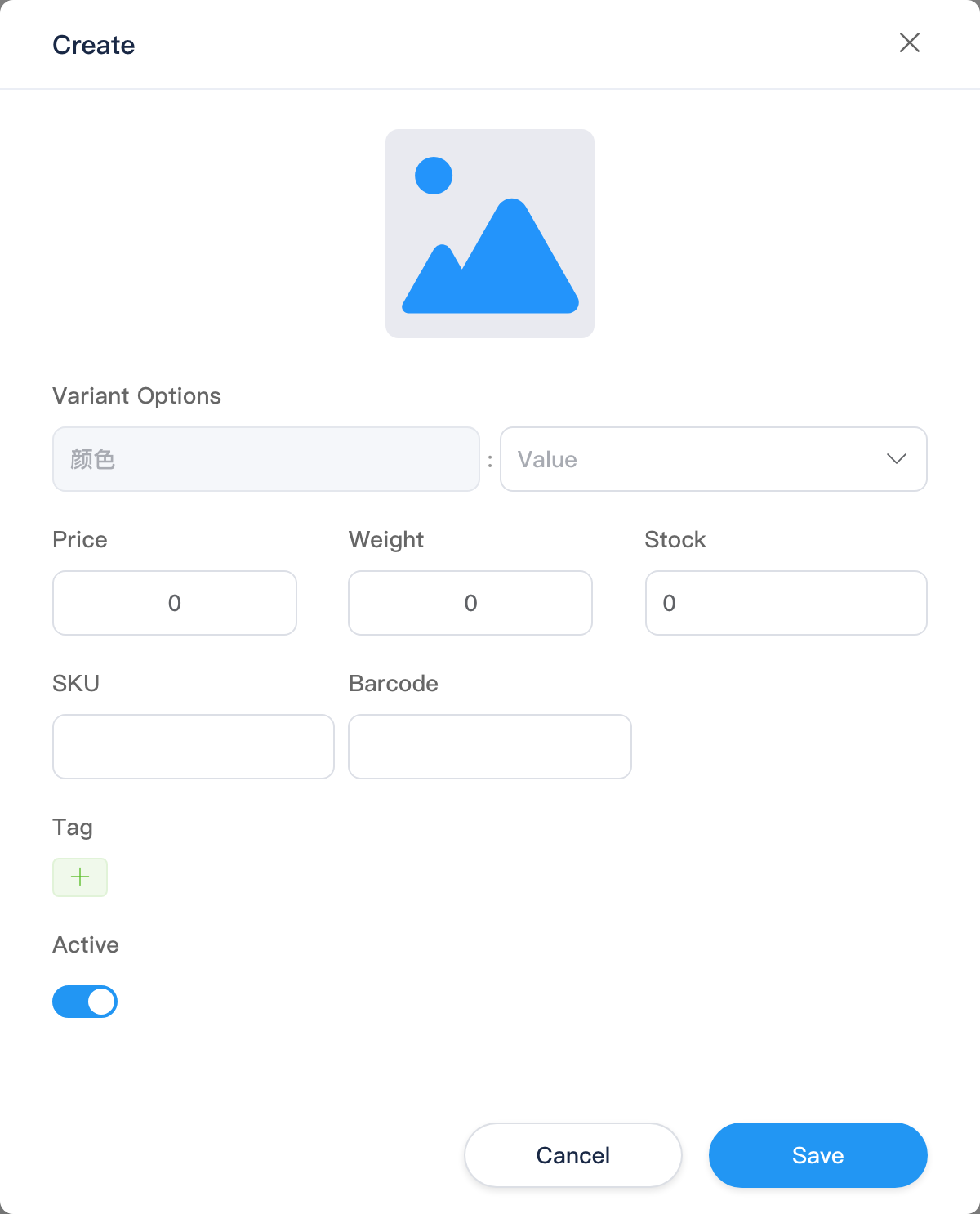
Combo must not duplicate existing variant; dropdown options from values already on current product.
Bottom Action Bar
| Button | Description |
|---|---|
| Cancel | Return to list without saving |
| Save | Validates basic info and custom fields; digital products validate delivery (if required) |
| Save and return | On success, return to list |
Related
- Product management (list) — includes digital products entry notes
- Product types — create digital product type
- Commerce settings — digital product delivery required, etc.
- Shipping (physical / digital products, auto delivery)