
Appearance
Content Types
Menu: Content → Content Types
Deep link:/_Admin/content/contentTypes?SiteId={siteGuid}
Edit:/_Admin/content/contentType?SiteId=...&id={typeId}(noidwhen creating)
Content types define the field structure of content entries (similar to a database table schema). Creating a content folder requires specifying a content type.
Prerequisite
You should already be inside the site admin. Before using k.content, read the Content overview.
How to Open
- Open Content → Content Types in the left sidebar.
- The list page route is
/_Admin/content/contentTypes?SiteId=....
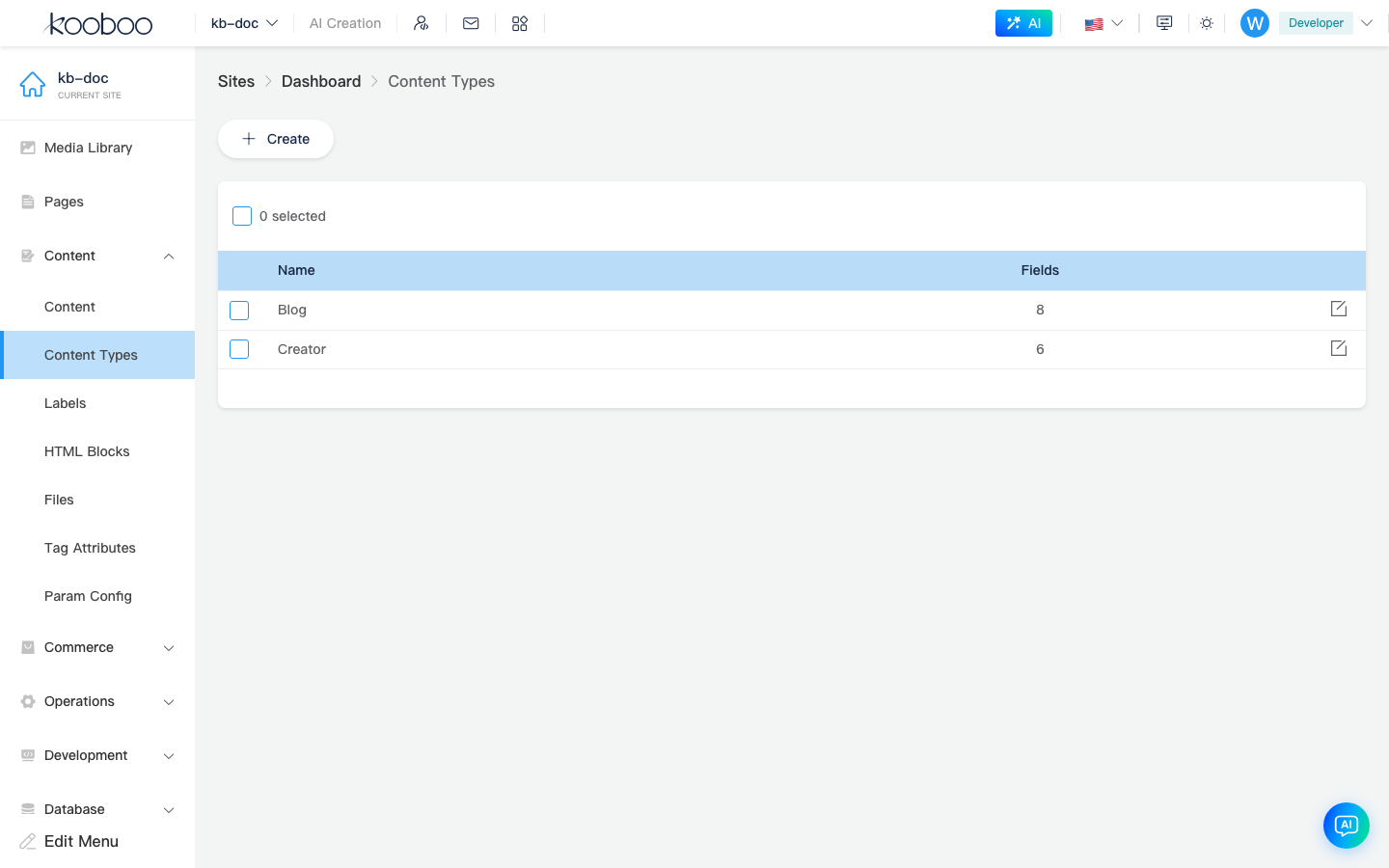
List Page
| Column / action | Description |
|---|---|
| Name | Type identifier; English names such as Article or Product are recommended |
| Fields | Number of configured fields |
| Edit | Opens the field definition page |
| New | Creates a new content type |
| Batch delete | Deletes selected types when dependencies allow (per system prompts) |
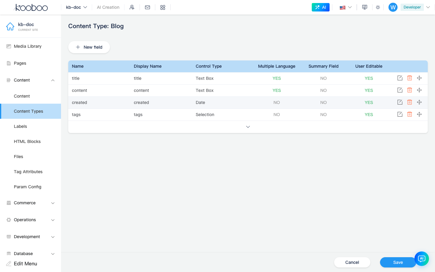
Edit Page: Type and Field List
- Click New (or Edit on the list).
- When creating, enter the Content Type Name (cannot be renamed after save).
- Maintain fields in the table; click New field or row Edit to open the Field Editor dialog.
- Fields can be dragged to reorder; expand System fields in the header (e.g. Id, created time); usually read-only.
- Save the whole page to persist type and fields (prompt if leaving with unsaved changes).
WARNING
Changing control types or deleting fields after go-live can affect existing content. Proceed carefully and back up first.
Field Editor
The dialog title is Field Editor, with Basic, Advanced, and Validation tabs. The bottom Preview area changes with control type.
Basic
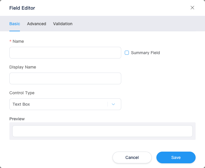
| Setting | Description |
|---|---|
| Name | Field key; should start with English letters; display name can change after create; name is usually locked after saving the type |
| Summary field | When checked, the field can appear as summary in content lists |
| Display name | Form label in the admin |
| Control type | See “Available control types” below |
| Default value | Most controls allow a default at the bottom of Basic (Content type excluded) |
| Preview | Read-only preview below the dialog reflecting control type and default |
Available control types:
| Control type | Typical use |
|---|---|
| Text box | Single-line text |
| Textarea | Paragraphs |
| Rich text | Body with images (toolbar configurable in Advanced) |
| Select | Single or multi select (depends on Enable multiple) |
| Checkbox | Multi-select list |
| Radio | Mutually exclusive options |
| Switch | Boolean |
| Image | Pick from media library |
| Advanced image | Image with meta (e.g. alt) |
| File | Pick from Content → Files (CMS file library), not k.file disk paths |
| Date-time | Optional Fixed timezone and timezone picker |
| Number | Numeric values |
| Color picker | Color |
| Key-value | Key-value pair list |
| Value list | Multi-value list |
| Content | Relate entries from another content folder (select target folder) |
Option-based: Select, Checkbox, Radio
After choosing Select, Checkbox, or Radio, configure option source.
Fixed options — maintain “display name + value” manually:
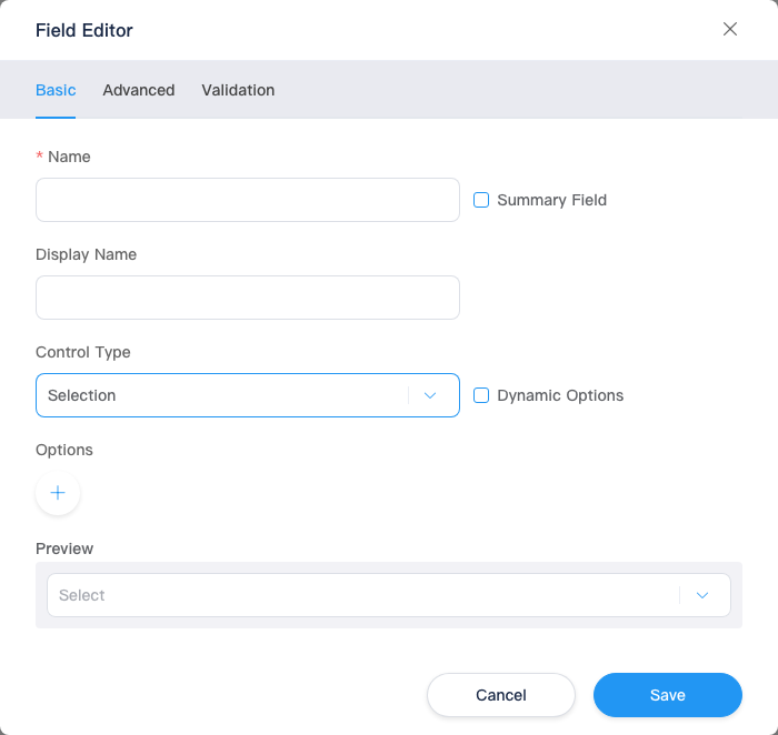
Dynamic options — check Dynamic options, return key / value arrays from KScript:
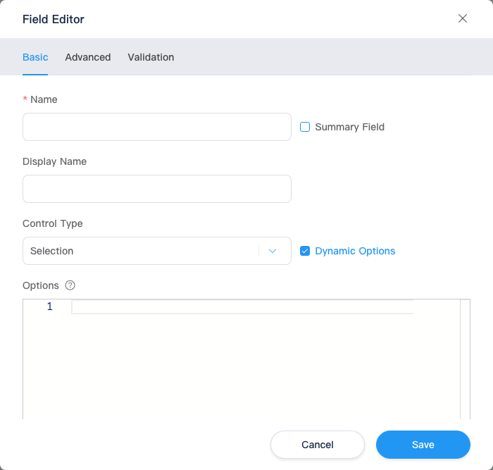
| Mode | Description |
|---|---|
| Fixed options | Fixed, small enumerations |
| Dynamic options | Options from runtime data (products, content, etc.) via server-side script |
Kooboo official example (e-commerce product list → dropdown):
typescript
const products = k.commerce.product.list();
return products.map((it) => {
  return {
    key: it.title,
    value: it.id,
  };
});key: label shown in the UIvalue: value stored on the content field
Non-commerce scenarios can use k.content.{folder}.all() etc., as long as the return is { key, value }[].
File and image: Enable multiple
When control type is Image, Advanced image, or File, Enable multiple appears on Basic:
- When checked, the field can store multiple files/images (e.g. gallery, attachments).
- Only changeable when creating a new field; may be disabled if a default is already set.
- Toggling Enable multiple clears any default value.
Date-time: Fixed timezone
After checking Fixed timezone and selecting a timezone, the field displays and stores values in that timezone, avoiding inconsistent editor local timezones.
Content type field
When control type is Content, select a content folder (existing folder name in the site) to pick related entries in this field.
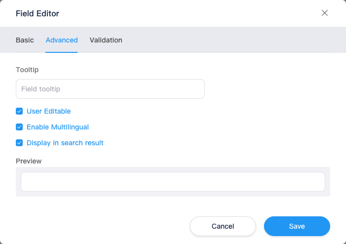
Advanced
| Setting | Description |
|---|---|
| Field hint | Placeholder text on the input (tooltip) |
| User editable | Whether end users can change the field on the front end |
| Enable multilingual | Store per language; applies to text box, textarea, rich text, image, key-value, value list, file, etc. (when shown in UI) |
| Show in search results | Whether the field appears in content search results |
| Rich text | Configure TinyMCE toolbar, fonts, sizes (may follow site default rich text settings) |
| Text box | Auto-generate from field and pick another text box/textarea field as source |
| Advanced image | Meta key-value table for extra image attributes (e.g. alt); supports src etc. are reserved keys |
System fields can also set User editable on Basic; custom field advanced options follow the dialog.
Validation
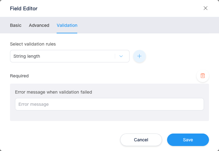
Configure validation on save and validation failure messages (custom error text). Switch controls and system fields usually have no this tab.
Steps:
- Pick a rule type in Select validation rule.
- Click + to add; multiple rules allowed (generally one per type).
- Under each rule, set thresholds/patterns and validation failure message for users (placeholders may appear beside fields, e.g. file type/size templates).
Rules by control type (unlisted types usually only Required):
| Control type | Available rules (examples) |
|---|---|
| Text box, textarea | Required, unique, string length, min/max length, regex |
| Number | Required, range, min/max value, regex |
| Checkbox, content | Required, minimum selected, maximum selected |
| Image | Required, max file size, allowed file types (extensions) |
| Others | Mostly Required |
| Rule | Parameters |
|---|---|
| String length / range | Min and max |
| Min/max length, min/max selected | Single number |
| Regex | Regular expression |
| File size | Number + KB/MB |
| File type | Extension multi-select (e.g. .jpg, .png) |
When saving a field, if Basic, Advanced, or Validation fails validation, the dialog switches to the corresponding tab.
Relationship to Content Folders
- One content type can be referenced by multiple content folders (when the product allows).
- When creating a content folder, the Content type dropdown lists existing types; the type usually cannot be changed after the folder is created (per UI disable state).
- From the content folder list, use Edit content type (pencil icon) to jump here.
Relationship to Development Docs
| Admin | Development |
|---|---|
| Type name, field names | Properties on objects from k.content.{folder}.get() |
| Dynamic options script | Server-side KScript returning key-value arrays |
| Multilingual fields | Works with site languages and culture |
| Validation rules | Validated on admin save; API behavior in k.content |
| Query and filter | k.content · k-data |
Related
| Doc | Description |
|---|---|
| Content folders | Bind type and enter entries |
| Content overview | Menu overview |
| Media library | Resources for image/file fields |
| k.content | Script access |